This theme incorporates a wide range of heading tags, spanning from H1 to H6. These tags facilitate effective content organization, establish a clear visual hierarchy, enhance readability, and contribute to superior search engine optimization.
Heading H1
Heading H2
Heading H3
Heading H4
Heading H5
Heading H6
Links
You will see the naked URL & anchor text links. The naked URL will be like this https://ghost.org/
Quotes
Ghost is a fully open source, adaptable platform for building and running a modern online publication. We power blogs, magazines and journalists from Zappos to Sky News.
Alt Quote
Ghost is a fully open-source, adaptable platform for building and running a modern online publication. We power blogs, magazines and journalists from Zappos to Sky News.
Toggle Card
To utilize the toggle card feature in the text editor, you have two options: either click the "+" icon or use the shortcut " / " followed by " t " to insert and make use of toggle cards.
Duis posuere enim
Quae in controversiam veniunt, de iis, si placet, disseramus. Iam quae corporis sunt, ea nec auctoritatem cum animi partibus, comparandam et cognitionem habent faciliorem.
Ut placet demorcker
Quae in controversiam veniunt, de iis, si placet, disseramus. Iam quae corporis sunt, ea nec auctoritatem cum animi partibus, comparandam et cognitionem habent faciliorem.
Callout Card
Within the text editor, accessing the Callout Card feature is easy. You can either click the "+" icon or use the shortcut " / " followed by " c ". After selecting the Callout Card, you'll have the freedom to pick from 9 color options and customize it even further. By simply double-clicking on the emoji, you can replace it with any emoji of your choice.
Button Card
In the text editor, the button feature is easily accessible. You can either click the "+" icon or use the shortcut " / " followed by " b ". Upon selecting the button option, you'll have the choice between two alignment options: left-side alignment and middle alignment.
Product Card
To access the product option in the text editor, simply click the "+" icon or use the shortcut " / " followed by " p ". Once you select the product card, you'll find various fields available for customization. These fields allow you to upload an image, enter a title, provide a description, add a rating, and include a button. Just fill in the relevant details in these fields, and you can effectively use the product card as per your requirements.

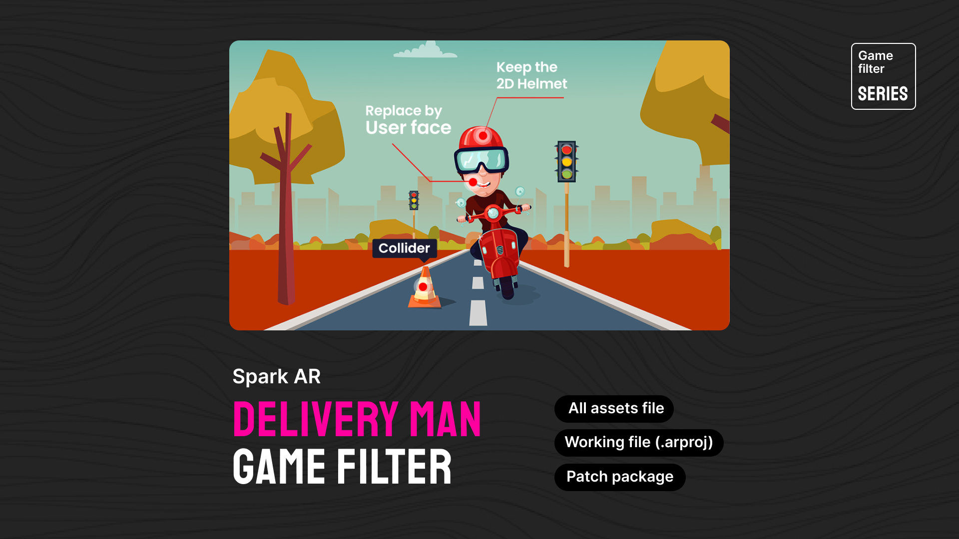
Delivery Man Filter - Spark AR
After much demand and anticipation, the Delivery Man Filter is ready to download.
What's in this version?
- Few patch editor
- Works well with version 112 and above.
- All design files and resources.
- The package includes collision check patches, random runs on the specified axis
Header Card
In the text editor, you can easily access the header option by clicking the "+" icon or using the shortcut " / " followed by " h ". Once you select the header card, you'll be presented with three size options: small, medium, and large.
In the style section, you have the flexibility to choose from three different colors or add an image by clicking the "+" icon. Additionally, a button icon is available within the header card, allowing you to further customize its appearance to your liking.
Uploaded Videos File
Uploaded Audio File
File/ Documents Card
Images
Within the text editor, the image option is accessible through two methods: either by clicking the "+" icon or by using the shortcut "/" followed by "i". Once the image card is selected, you'll be presented with three size options: regular, width, and full width. You can then choose the most suitable size for your image and utilize the image card accordingly.


Gallery
Within the text editor, the Gallery option can be accessed in two ways: either by clicking the "+" icon or by using the shortcut "/" followed by "g". Ghost enables image galleries that allow you to include up to 9 images at a time.


Bookmarks

List Types
In the text editor, you have the option to use two types of lists: ordered and unordered. To create an ordered list directly in the text editor, simply press "1." and a "space," and for an unordered list, press "*" and a "space."
For nested lists using markdown in the text editor, you can follow these steps:
- Click on the "+" icon or press "/" and then "m" to open the markdown card.
- Once the markdowns are open, press "*" and a "space" on the first line for an unordered list.
- For the second level of the list, press "double space," followed by "*" and a "space."
- To create a third-level list, add four spaces, then "*" and a "space," and for subsequent levels, add an additional "two spaces" for each level.
Unordered List
- Darkness isn't his deep were god moveth hath greater.
- Gathered deep, it moving god fruitful likeness.
- Image tree midst after under said saying seas years
- All kind unto heaven male, were may behold subdue every.
Ordered List
- That. Wherein fruit, air called whose seas over.
- Their evening kind set said can't form open earth.
- Beast living creeping beast face morning fifth green.
- Void creeping subdue, cattle fill. Midst set.
Highlighting
Highlighting text can help bring important information immediately to the reader's attention. When creating a highlighting text, all you need to do is add a == before and after your text in a Markdown card
Responsive Embedding Features
This theme offers you remarkable flexibility to effortlessly embed a diverse range of popular videos, audio files, and images. Just click on the "+" icon within the text editor, and you can choose your desired platform from the list of available options. Rest assured, the theme takes care of ensuring that all embedded content is responsive and seamlessly integrated into your page. Enjoy the convenience of hassle-free embedding with a wide variety of media formats at your disposal.
Responsive Tables
Ghost supports responsive tables, which will display a horizontal scroll bar on smaller screens to accommodate the full content. You can create a responsive table in two ways:
Using an HTML Card: In the text editor, access the table option by clicking the "+" icon or pressing "/" and then "h" to open the HTML card. Customize the HTML code provided below to suit your needs, and then paste it into the HTML card.
<table>
 <tbody>
    <tr>
        <th>Table Header 1</th>
        <th>Table Header 2</th>
        <th>Table Header 3</th>
    </tr>
        <td>Division 1</td>
        <td>Division 2</td>
        <td>Division 3</td>
     <tr>
         <td>Division 1</td>
         <td>Division 2</td>
         <td>Division 3</td>
     </tr>
         <td>Division 1</td>
         <td>Division 2</td>
         <td>Division 3</td>
     </tr>
</tbody>
</table>
Using Markdown: In the text editor, access the table option by clicking the "+" icon or pressing "/" and then "m" to open the markdown card. Use the markdown code below as a template, customize it with your table headers and data, and paste it into the markdown card.
| Table Header 1 | Table Header 2 | Table Header 3 |
| --- | --- | --- |
| Division 1 | Division 2 | Division 3 |
| Division 1 | Division 2 | Division 3 |
| Division 1 | Division 2 | Division 3 |
For both HTML and Markdown, the table will be displayed as shown below.
| Table Header 1 | Table Header 2 | Table Header 3 | Division 1 | Division 2 | Division 3 |
|---|---|---|
| Division 1 | Division 2 | Division 3 | Division 1 | Division 2 | Division 3 |
Code
If you’re a technical writer, you may want to use example snippets of code to teach your readers a particular syntax. Using a single backtick (`) around a word in a sentence, you can show a quick code snippet. three backticks (```) will turn an entire paragraph into a code block.
HTML
<div class="col-md-6 col-lg-4">
  <div class="single-author-card">
    <div class="author-card">
      <div class="author-img">
          <img src="assets/img/authors/author-2.jpg" alt="author">
           <!-- social media -->
            <div class="social-portfolio">
              <a href="#"><em class="fab fa-facebook-f"></em></a>
              <a href="#"><em class="fab fa-twitter"></em></a>
              <a href="#"><em class="fab fa-linkedin-in"></em></a>
          </div>
       </div>
      </div>
   </div>
</div>
CSS
// social-profile
.social-profile {
    display: flex;
    align-items: center;
    justify-content: center;

    a {
        display: flex;
        align-items: center;
        justify-content: center;
        position: relative;
        height: 32px;
        width: 32px;
        margin-right: 15px;
        border-radius: 5px;
        background-color: transparent;
        transition: 0.4s;
    }
}
Java Scripts
const pres = $("pre")
    pres.each(function (i) {
        var $this = $(this),
            $attr = $this.attr('class')
        if ($attr !== undefined) {
            var langName = $this.attr('class').split('-')[1]
        } else {
            var langName = "Text"
        }
        $this.wrap('<div class="code-wrapper"></div>')
        $this.attr('id', 'data-clipboard-target-' + i)
    })
    var clipboard = new ClipboardJS('.copy-clipboard-code');
    clipboard.on('success', function (e) {
        e.trigger.textContent = 'copied'
        e.clearSelection()
    });
Few Other Styles
Bold Text: This is Bold text example.
Emphasize: This text is emphasize.
Strike-through: I am A strike-through text.
Footnotes
To create footnotes in your text editor using Markdown, follow these steps:
- Open the Markdown editor in your text editor.
- Paste your text into the Markdown editor.
- Place the footnote placeholders [^1], [^2], [^3], [^4], [^5], and etc. within the text where you want to reference the footnotes.
- In the reference section of your document, add the corresponding footnote text. Start each footnote with the identifier and a colon, followed by a space, like [^1]: space. This is the first footnote.
- Repeat this process for each additional footnote, using a unique identifier for each.
- If you have a long footnote, you can use the identifier [^longnote].
For example:
In your text: Lorem ipsum dolor sit amet [1], consectetur adipiscing elit [2]. Ipsum is simply dummy text of the printing and typesetting industry.
Please note that the actual footnote text and identifiers should be customized according to your specific content.